
From paper prototypes to four million consultations
We started with nurses before there was a product, used what we learned to shape the first paper prototype and stayed involved as the platform grew.
CLIENT
Healthforce
METHODS
Contextual visits, In-depth interviews, Usability testing
REGION
South Africa
YEARS
2018 - 2024
The brief
South Africa runs two health systems. A well-resourced private sector serving a minority, and an underfunded public system carrying everyone else. 14.1% of South Africans have medical aid. In Limpopo it is closer to 7%.
That does not mean everyone else stays out of private healthcare. There is a large group of South Africans who have some money and are able to pay for healthcare, just not at the price existing private healthcare charges.
The public alternative may not carry the same direct cost, but it can take up much of a working day. Research across 419 public facilities found an average waiting time of three hours and seven minutes, with waits of more than five hours at 8% of the facilities.
Healthforce was built around a different way of dividing the work. A clinic nurse takes the patient’s history, records their vital signs, conducts the examination and manages the consultation. When the nurse needs a doctor, one joins by video.
The model makes sense on paper but in a clinic, it depends on one important assumption: that the nurse in the room will trust the system and use it.
That is where we came in. Before there was software to test, we started with the nurses.
The challenge
How might we design clinical software for a nurse who does not like technology, and has very little time to learn a new system?
Nurses came to us with different levels of comfort in front of a screen. Some already used devices in the clinic and took to the idea quickly. Others, mostly in independent pharmacies and container clinics, worked on paper and had no desire to stop.
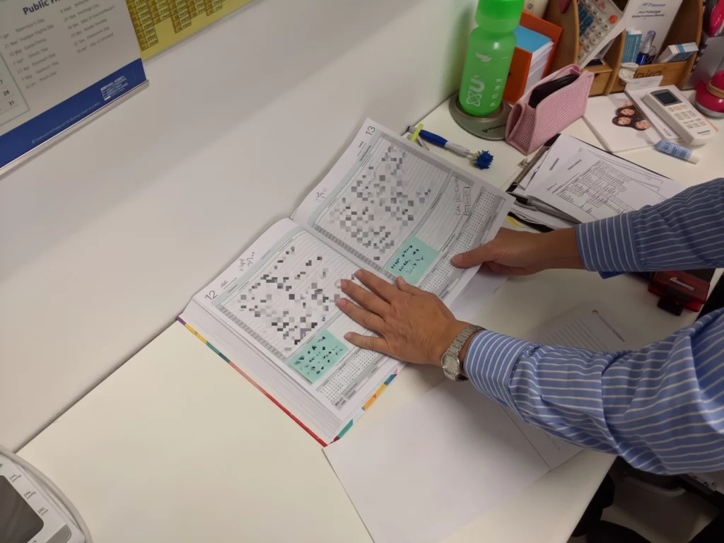
That split mattered less than the thing they had in common. For all of them, the most trusted thing in the room was the diary. Paper never argued. It never asked for a particular field to be completed before it would let them move on, and it never made them describe a patient in somebody else's categories.
So the problem statement we kept repeating internally was not about software at all.
How do we compete with a piece of paper?
That question rules out most of what clinical software normally looks like. A screen of correctly structured, mandatory fields is a downgrade from a blank page. A nurse used to writing whatever she judges to be relevant, in whatever order she likes, is not going to accept a form that argues with them. If the digital version is slower and more restrictive than the diary, she keeps the diary, and no amount of go-to-market stratagy fixes that.
The job was to give them the freedom of a blank page, and then show them something paper could never do.
What we did
Discovery research
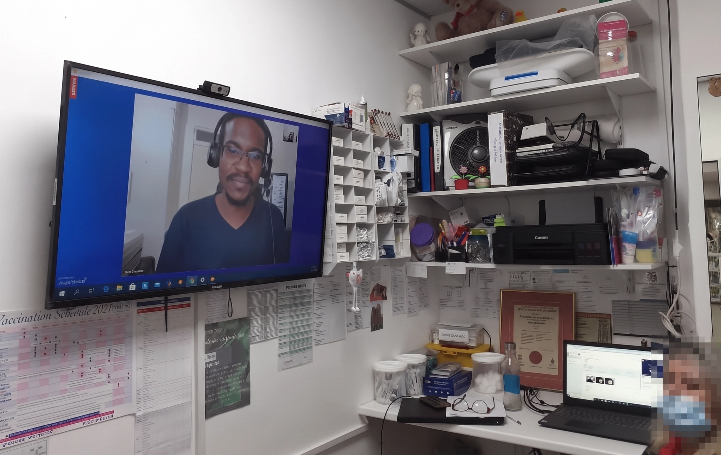
We visited nurses in clinics across the country to interview them about what they were using, if anything. What was in their way, where the gaps were, and how they felt about technology in a consultation room (many of them did not want it there).
The design sprint
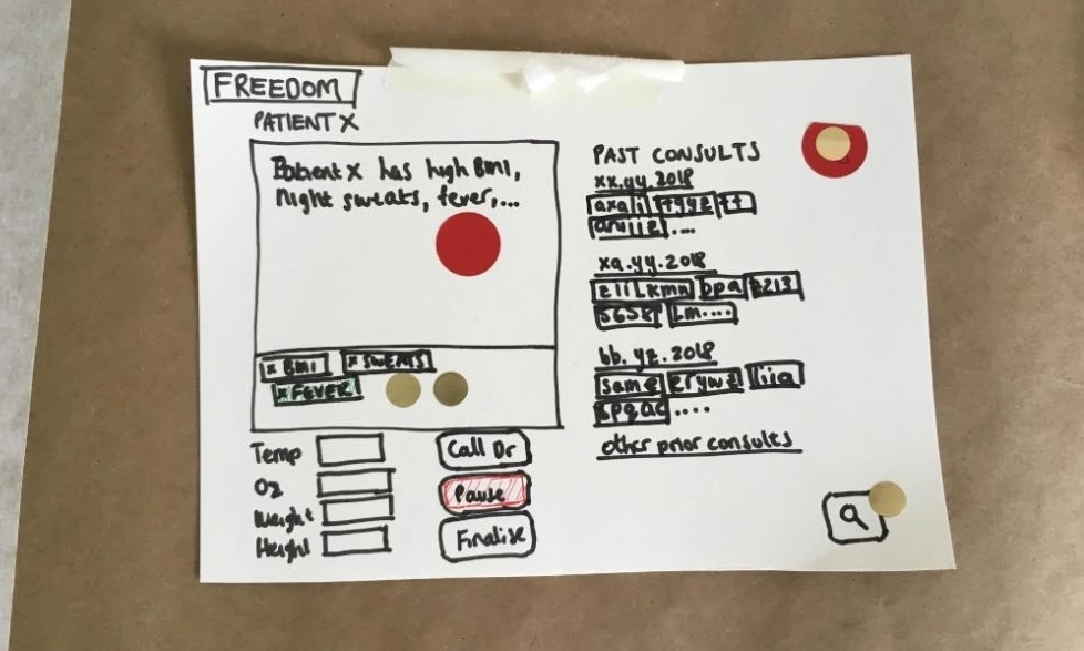
We took the interviews into a sprint, turned them into How Might We statements, and ideated interfaces against them. What came out was drawn on paper. Those paper prototypes became the Healthforce interface.
Testing it
We tested with 5 clinic nurses across deliberately different settings in Cape Town and surrounds: chain pharmacy clinics, independent pharmacies, a container clinic in Gugulethu, and a nurse who also works in a government clinic. Every issue was graded from good thing, to paper cut, to speed bump, to road block. A paper cut is something a nurse absorbs and complains about later. A road block is a patient still sitting in the room while she phones for help.
What that meant on the screen
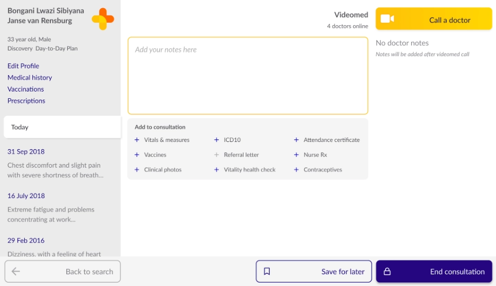
Two decisions answered the paper question. We made the notes field the most prominent thing on the consultation screen. Not a grid of validated inputs, a place to write anything. Nurses are trained to structure a clinical note, so the structure could come from their nurse training rather than from our validation rules. Then we surfaced the patient's history, because history is where paper actually fails. Finding what happened at the last visit, in a paper diary, is the worst part of the job.
That was the real value proposition. Once nurses could see a patient's history, and what other nurses had recorded about the same patient, the extra typing paid for itself.
Then six years of collaberation
Interviews with the people at the edges of the workflow, who are usually the ones a new system quietly breaks. Patient research. Feature testing with nurses in live clinics. Eventually a standing monthly research commitment with the clinic team, rather than a project scoped each time a question came up.
Who's in charge?
Paper was the obstacle we expected. The second one was not on the screen and came in the form of two questions:
1) Who's to blame if the doctor gets it wrong?
Nurses new to video consultation were hesitant, and explisit about why. By recommending a video consultation, they believed they were taking on the clinical risk. If the doctor missed something, or prescribed something the patient was allergic to, they expected to be held responsible. The consent form did not reassure them. It was in English only, long and legal, and nobody reads it properly.
2) What if the nurse disagrees with the doctor?
Many of these nurses trained in settings where the doctor's opionion is the only opionon, and the nurse's job is to carry out instructions rather than argue with them. A remote consultation cannot work that way. The doctor is not in the room. They cannot examine the patient, feel a temperature, or observe the patient's body lngage when they walk in. The nurse needs to lead the consulation.
So we worked on it from both sides. With the nurses, we empoyerd them to hold a clinical opinion and voice it. And with the doctors, we made sure they created the space for nurses to have a voice and know they owned the consoltation.
That is service design, not interface design, and you only find it by sitting in the room with the people who do the job.
What impact did it have?
The 2018 testing produced a specific list for the build, including a vaccination flow the nurses designed themselves: separate child and adult vaccines, past vaccinations with dates and batch numbers, and enough of the road-to-health record that a lost booklet is not lost data.
The platform launched in 2018. Dis-Chem invested in 2020 and acquired the business in 2021. By 2023, Healthforce-enabled clinics had delivered over 4 million nurse-led consultations across more than 550 clinic rooms, at an average NPS of 75. Roughly 80% of the time, the nurse handles the visit without needing the doctor at all.
A nurse consultation costs R99. If she needs the doctor, the video consultation is R275. No medical aid, no appointment, no morning in a queue.
We did not build the platform and we did not scale it. What we did was start with the nurses before there was anything to show them, and put the reasons they might refuse to use it on the table early rather than leaving them to be found in a clinic.
From the founder
"My experience of working with How Might We is exactly the experience I want to create for my customers when they work with my organisation. There is a clean, understandable, simple, uncluttered, thoughtful and beautiful aspect in every interaction with Chris and his team. From initial engagement, to contracting, to planning, to their reports and outputs, to the way they have engaged with my engineering team, it has been a great user experience."
Saul Kornik, Founder of Healthforce